The thinking
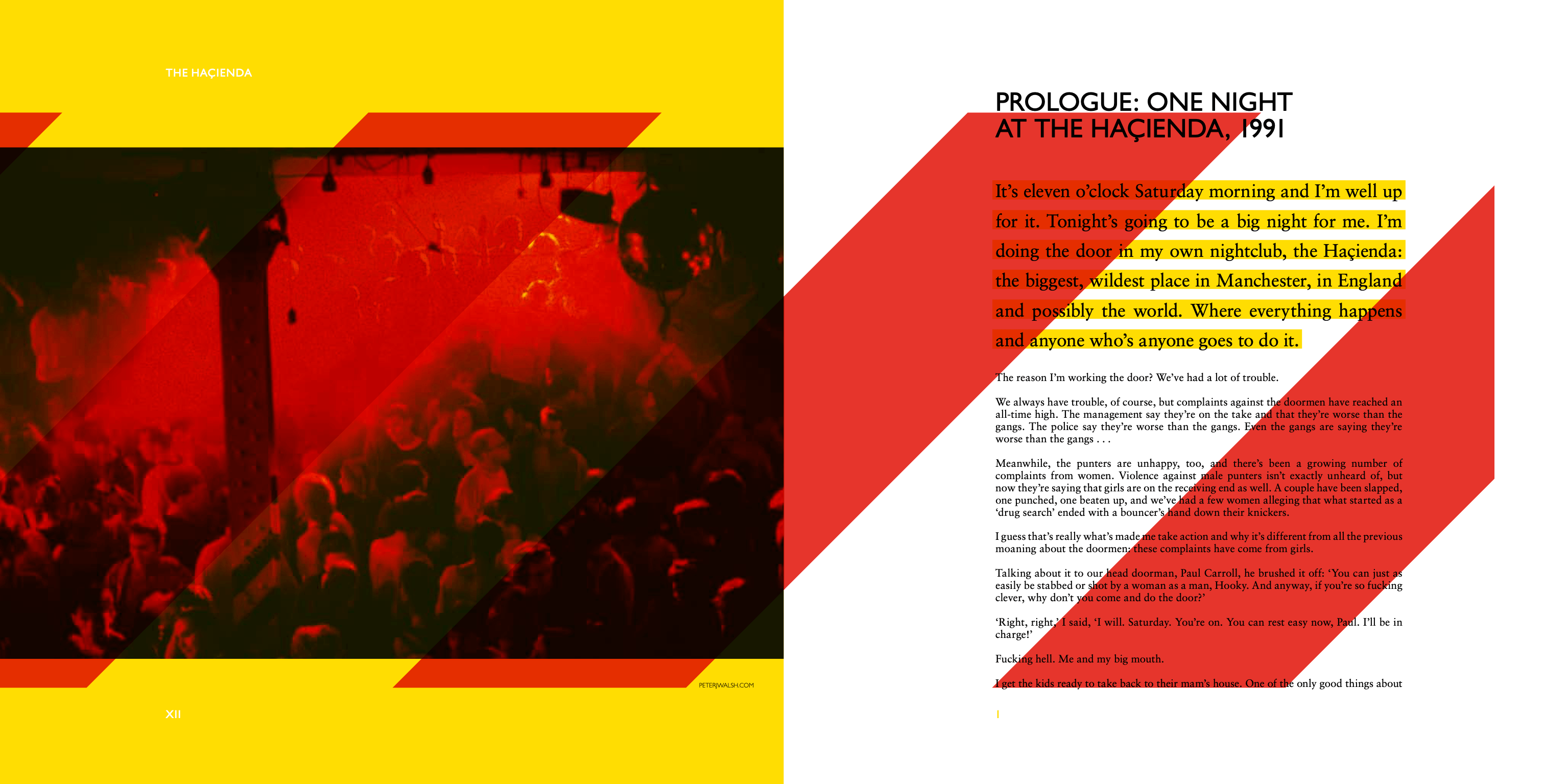
The Haçienda has one of the most iconic visual identities in music history: Factory Records, Ben Kelly’s architecture, the yellow and black chevrons. The opportunity wasn’t to handle history carefully, but to celebrate it loudly: turning the volume up, and pushing it somewhere new.


Working alongside Andy Vella — whose unique work for The Cure I had admired since I was a teenager — I took the chevron motif as my starting point and remixed it: colourful, jagged, layered, distorted. The idea was to reflect the energy and contradiction of the club itself — the ecstasy and the cock-ups, the triumphs and the chaos — rather than produce a reverential document about the past.
The physical formats were designed with the same thinking. The signature edition is square, like a vinyl record, with the cover’s embossed chevrons interacting with a yellow plexiglass slipcase so the nickname ‘Haç’ only fully appears once the package is assembled. The deluxe edition houses the book in a hinged maple box, a reference to the dancefloor, which was made from the same material. Both editions include a mounted piece of the actual grimy, sweat-soaked Haçienda dancefloor.
The opportunity wasn’t to handle history carefully, but to celebrate it loudly: turning the volume up, and pushing it somewhere new.

Signature edition — packaging by Andy Vella


Deluxe edition — packaging by Andy Vella
The work
Three editions have been created: signature, deluxe, and ultimate, each escalating in ambition. The ultimate edition includes a bass guitar made from wood salvaged from the dancefloor, finished in the yellow and black chevron motif. Inside each format has new text from Hook, reprints of rare club flyers, membership cards, newsletters, and original visuals from club architect Ben Kelly.
The interior design aimed to match the energy of the packaging, and ultimately, the club itself. It needed to be a book that felt as considered inside as out, and worthy of the story it was telling.