The thinking
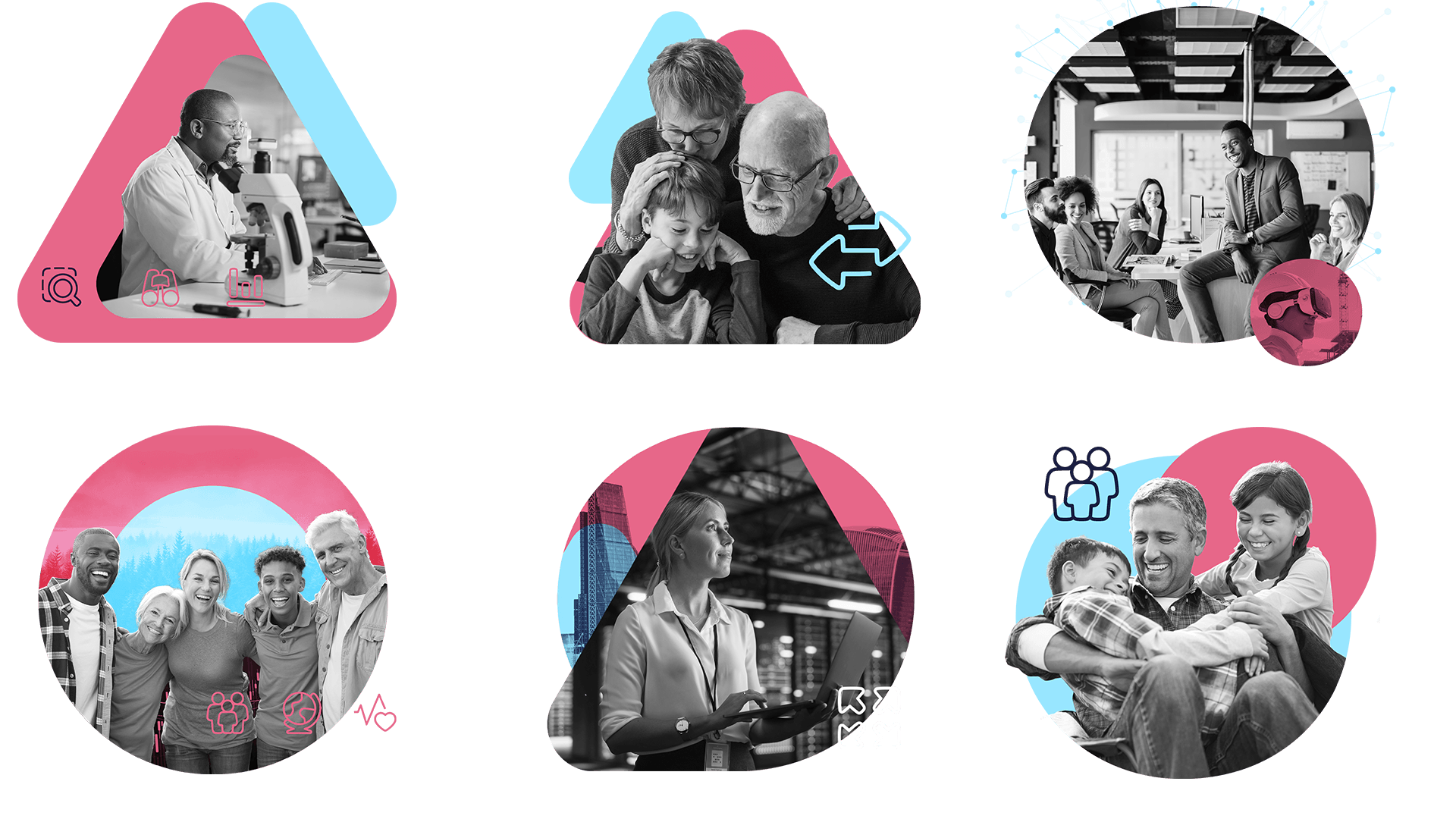
Because the nature of the visuals was so expressive and fun, I wanted to design a platform with genuine personality, one that could put student work at the centre and really let it shine. I wanted to build a framework that got out of the way and let the work breathe.
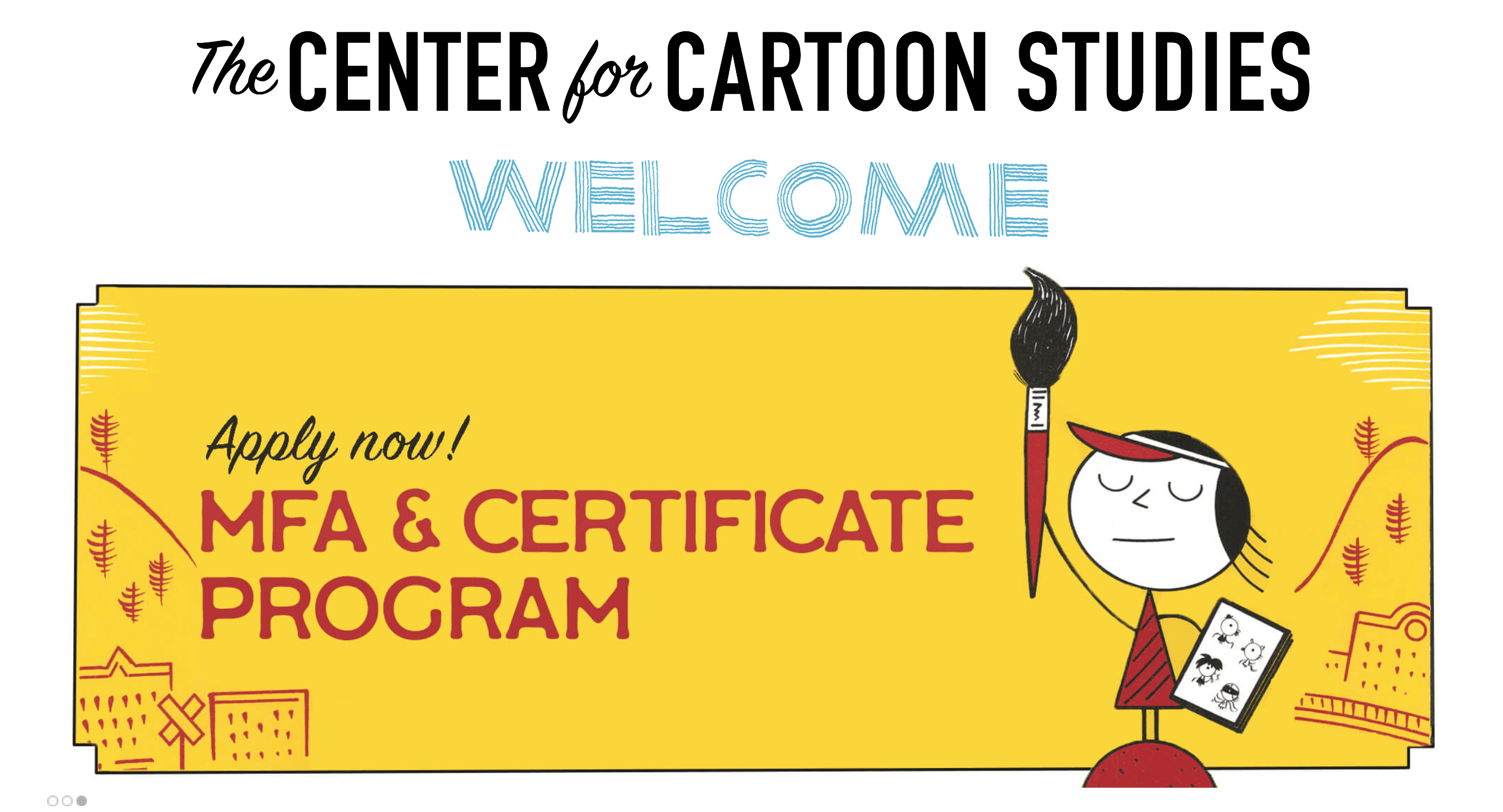
CCS gave me real creative ownership, and the work reflects it through a digital presence that’s colourful, expressive, and true to the school’s character.
The work
The main site homepage was designed from the start with a loose newspaper structure — short stories, columns, a mix of typography — giving it an editorial feel that suited the school’s medium without being a pastiche. It’s flexible enough to integrate images and accommodate change without losing its character.
Over time the relationship grew. I built out an intranet, a workshop microsite, a site for the Schulz Library, and a graduating students microsite — the latter produced annually, with a distinct visual treatment for each cohort that felt fresh without breaking the broader brand. The challenge was always the same: enough difference to feel unique, enough consistency to feel like CCS.


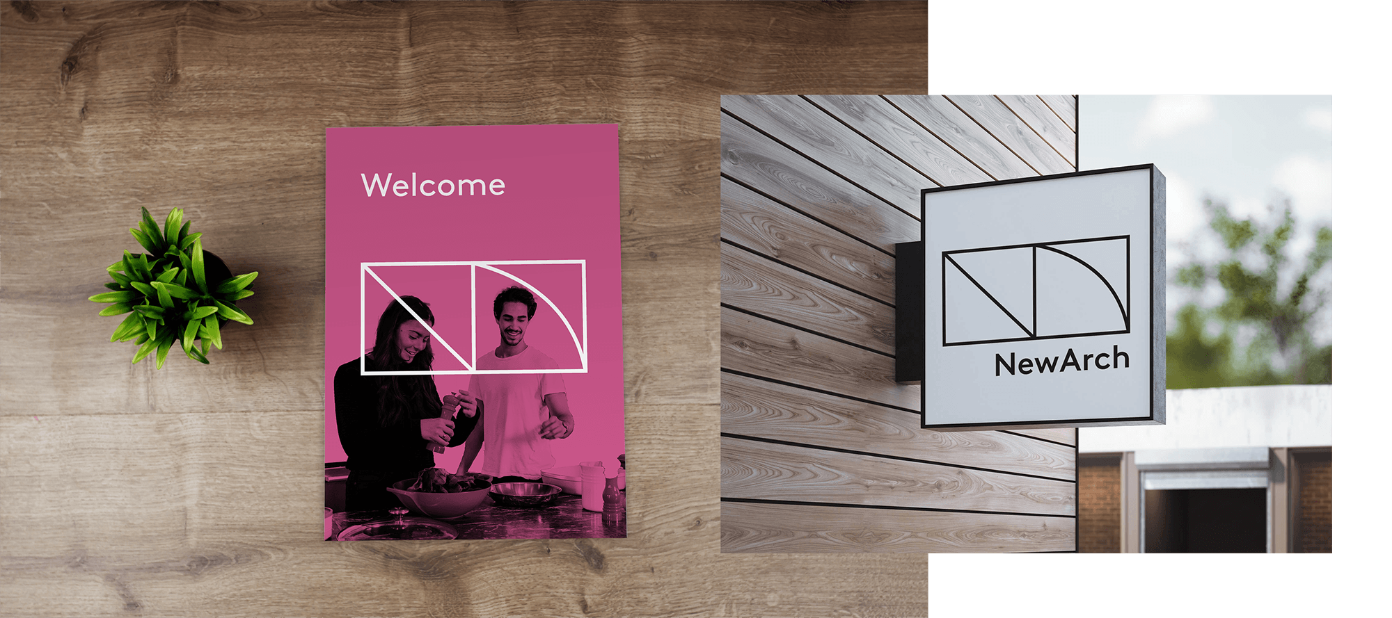
The college has a CCS Studio which produced a number of publications, covering topics including democracy, mental health, and the US healthcare system. For each of these I created a landing page which got their own sub-brand treatment. Distinct enough to stand apart, connected enough to feel part of the same family.
Throughout all of it, the student comic work was front and center. My role was to feature it as prominently as possible — bringing it forward into the digital context with small flourishes where needed, but never competing with it. The work was strong enough that the best thing I could do was stay out of its way.


The challenge was always the same: enough difference to feel unique, enough consistency to feel like CCS.