NewArch is an affordable housing initiative by Octopus Investments, developed as a completely standalone brand — separate from the parent company in name, identity and tone. The brief was to create something effective for the development that could stand on its own. In practice, that meant building an identity from scratch, with no existing assets or direction to draw from.
The thinking
The core challenge was emotional as much as visual: affordable housing carries associations that can feel institutional or downbeat, and this brand needed to feel the opposite — warm, optimistic, and genuinely inviting.
The central question was how to create an identity that felt human and hopeful without being naive or superficial. Two visual references became touchstones: the bold, graphic street murals of Camille Walala — structural and playful, with forms that almost read as windows and facades themselves — and the strong linework and stained glass designs of Charles Rennie Mackintosh, which brought a more classical architectural rigor and a quality of looking through things into something beyond.

Camille Walala

Charles Rennie Mackintosh
The work
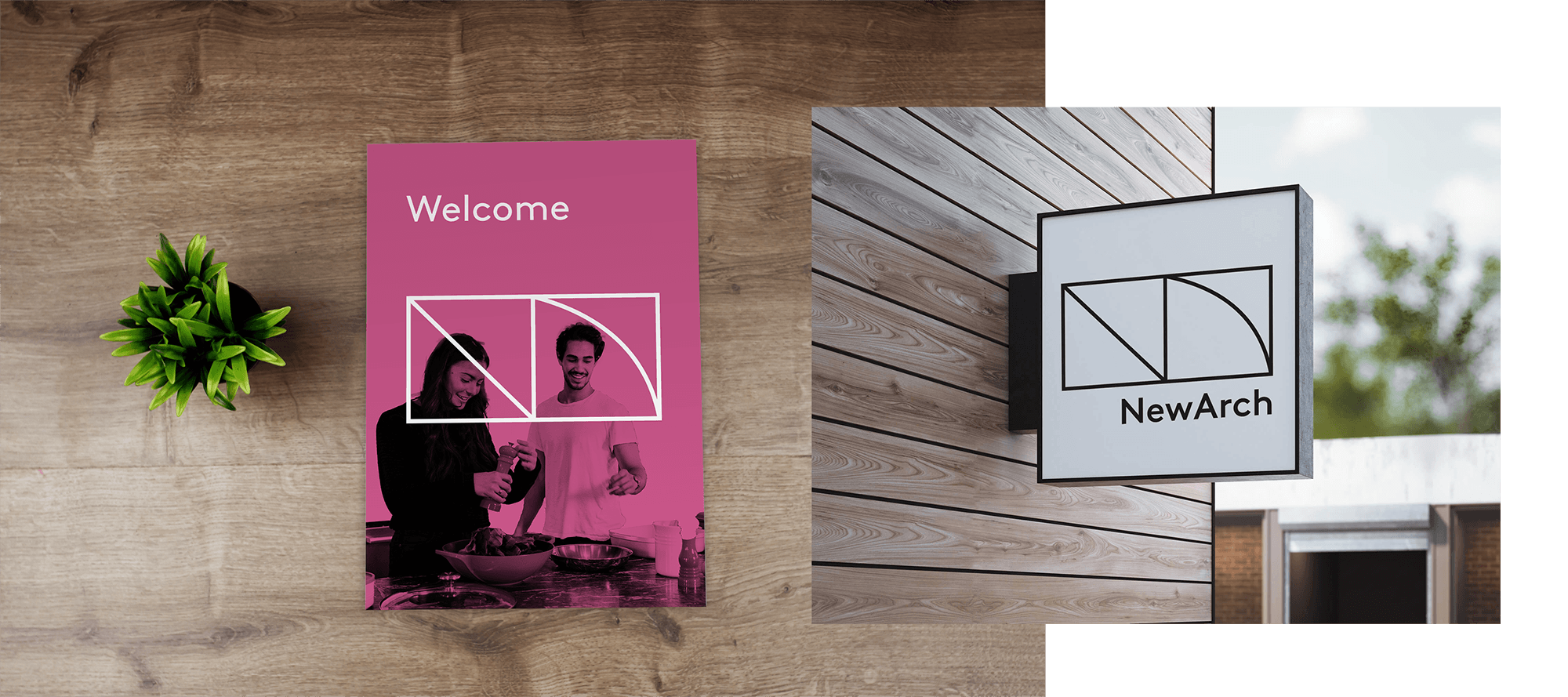
From those references came the logo concept: a stylized NA designed to function as a window — a frame that looks into people’s lives and homes rather than simply a monogram.
The color palette was built around the same emotional logic. A faded magenta brings warmth, energy and life, balancing a set of blues and grays that feel professional and reliable. Green lifts the palette, adding brightness and a nod to environmental values. Together they feel considered rather than corporate — a palette that could belong to a place where people actually want to live.

Colorway options

Starting from a blank canvas and a tight deadline, the process moved quickly from reference gathering and mood-boarding through to logo concept and palette development. The window metaphor emerged early and held — it gave the identity a conceptual anchor that informed decisions across every touchpoint.
The identity was applied across logo and brand guidelines, business cards, website layout, and report design — a full suite of assets built from nothing in a short timeframe.
The campaign was recognized with an internal award nomination at Octopus Investments, with colleagues describing the work as modern, eye-catching and thoughtfully executed — a strong result for a project delivered at pace from a completely blank canvas.
Affordable housing carries associations that can feel institutional or downbeat, and this brand needed to feel the opposite — warm, optimistic, and genuinely inviting