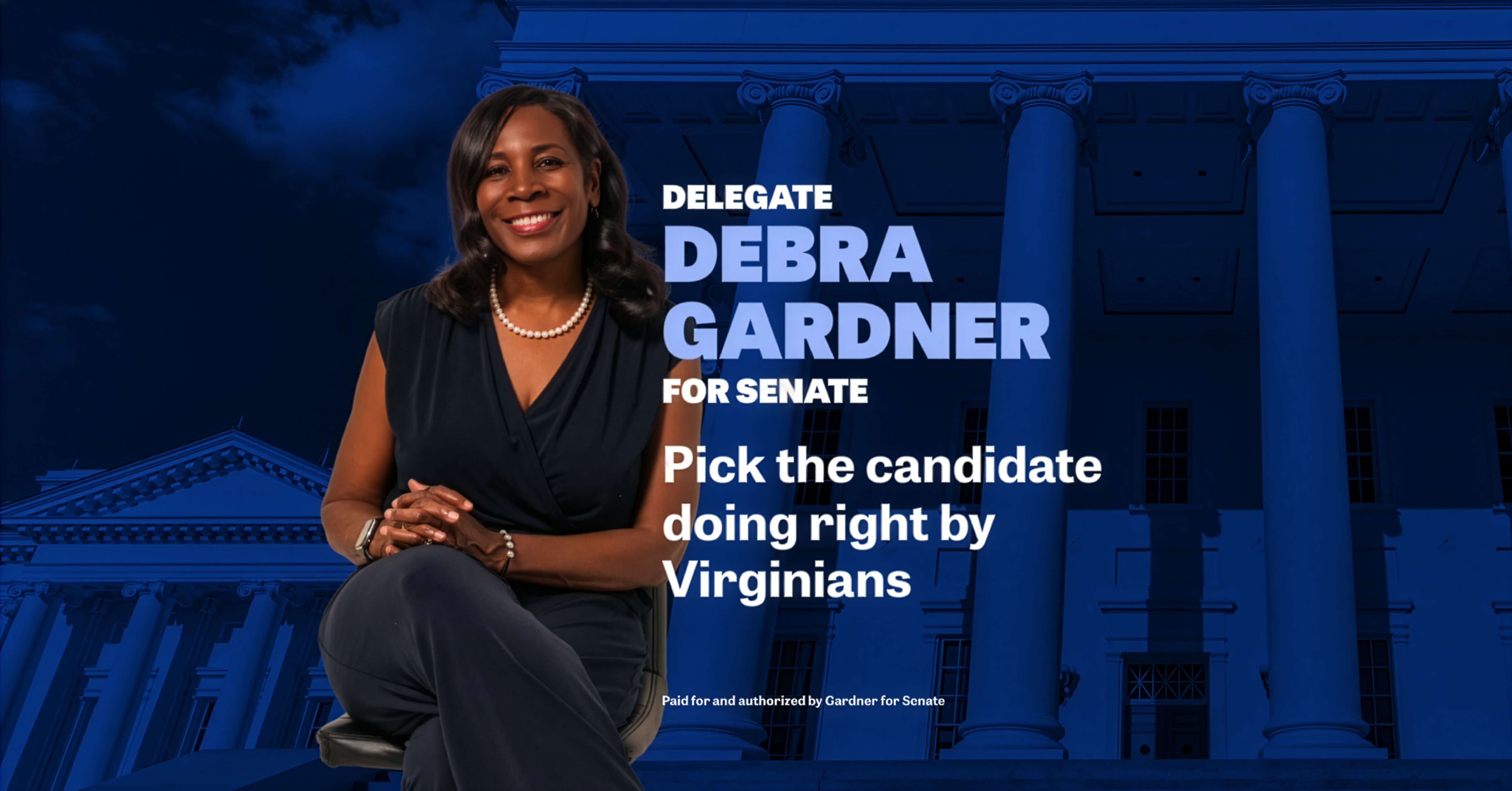
Tech for Campaigns is a US nonprofit that pairs volunteer tech and creative professionals with Democratic state-level candidates who couldn’t otherwise access that expertise. In 2024 I joined a campaign team supporting Tina Liebling’s Minnesota state race. In 2025, Debra Gardner’s Virginia campaign. Both candidates won.
The thinking
Political design for state-level campaigns has a specific constraint that sharpens your thinking quickly: you are not designing for people who already agree with you. You’re designing for a broad, mixed audience, which means the temptation to over-design — to make something that signals taste or sophistication — is exactly the wrong instinct. If a candidate looks more focused on style than substance, you’ve done them a disservice.
So the discipline here was restraint. Clean, contemporary, typographically confident. Visuals that felt current without feeling exclusive. For Tina Liebling’s campaign, an early concept drew on the newly redesigned Minnesota state flag — a way of grounding her candidacy in something local and shared. It performed well in testing, though ultimately a different direction won out through A/B testing. That’s the process working as it should.


Early design concept for Tina Liebling’s social posts, based on the Minnesota state flag, right.


Fiinal design concept for Tina Liebling’s social posts, based on the results of A/B testing.
For Debra Gardner, the creative answer was simpler: she’s an exceptionally photogenic person with a strong bank of imagery. The design let that do the work — bold typography, her face, her message. Sometimes the most confident creative decision is knowing when to get out of the way.

Early concepts
The temptation to over-design — to signal taste or sophistication — is the wrong instinct. If a candidate looks more focused on style than substance, you’ve done them a disservice.
The work
Each campaign produced static and animated social ads, with Tina Liebling’s work extending into Reel-style video — edited, and animated by me. The team was distributed across California, New York, and London, meeting twice weekly with the candidates directly. Feedback came straight from Tina and Debra in those sessions; I’d present, take notes, and come back with updates the following week.
These aren’t the most visually ambitious pieces in my portfolio. But they’re some of the most important work I’ve done — using the same skills I’d apply to any brand project to contribute to something that actually matters. In 2025, Tech for Campaigns recognized the work with a nationwide Volunteer of the Week acknowledgement.
Both candidates won their races.