Enterprise Risk Magazine came to me with an established brand. Theirs is a no-nonsense, credibility-first name, and they wanted a new site to stay true to that: no reinvention, just a faithful, elegant execution of who they already were. But there were issues to address.
Their previous site had been built on a cumbersome site builder tool, with many pages slowly created individually. That made it difficult to maintain, so the team didn’t often update the site. Visually, the layouts had become repetitive, with multiple pages of similarly boxy story previews that flattened much of their content. And the site hadn’t been updated to their current branding.
Beyond appearance, running ads required manual effort without engagement data, which made it hard to sell new placements to clients. The site didn’t work on mobile. They were restructuring their content and wanted to introduce Events and Communities themes.
The challenge wasn’t developing a new brand. It was solving those problems all at once, on a budget and timeline that a fully manual build couldn’t have met.
The thinking
The client and I started the project with a series of conversations about the problems they were trying to solve. I designed their home page in Figma using their current branding, introduced some new ideas, and demonstrated how the new site could look. I then built their brand guidelines into an AI system so that I had a quick way of applying them to the other page wireframes.
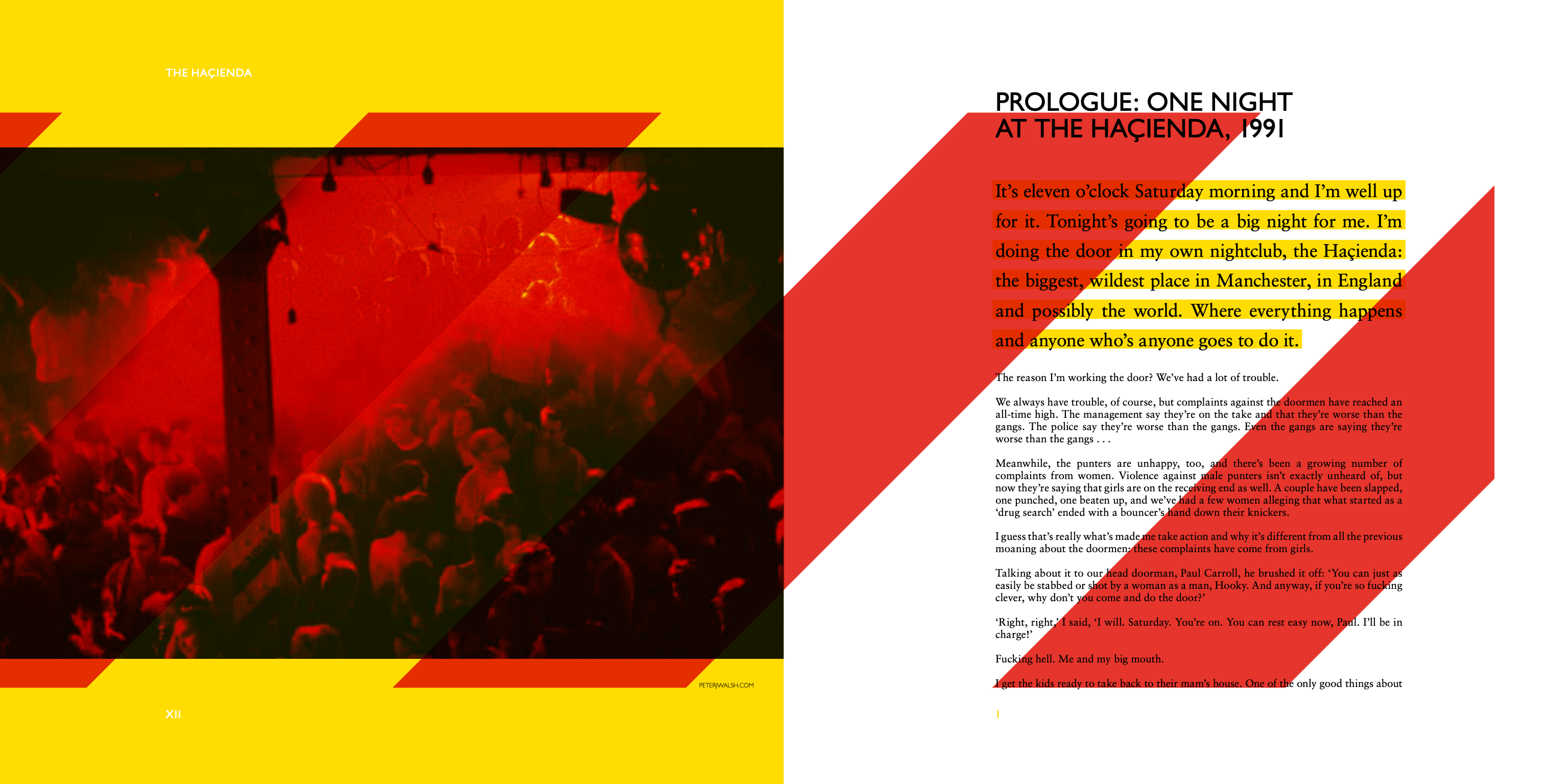
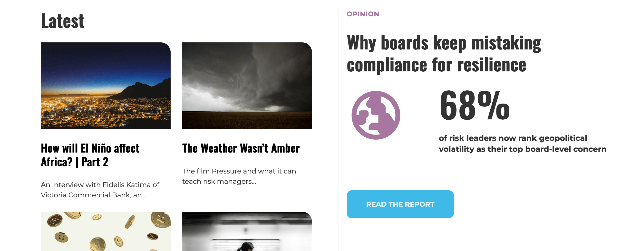
Those conversations shaped the editorial thinking as much as the visual one. Individual stories now have a unique layout and editable pull quotes that draw readers in, rather than a uniform template repeated across every post — differentiating them from other types of content. The homepage shows a large infographic as another way of pulling readers into a story. A carousel of Communities interest areas shows the latest articles for a range of risk-related subjects, and a dedicated Events system gives them a home for announcements that previously had nowhere to live. An easier, more sophisticated, automated advertising platform was built in too.
All of that design thinking — the page concepts, the editorial logic, the decisions about what each layout needed to do — started on paper or in Figma.
What the new site delivers
Where AI came in
I’m careful about where AI gets involved in my work process. The creative decisions, the brand application, the layout concepts, the editorial thinking behind carousels, infographics or pull quotes — all of that was the same visual thinking I’ve always done, worked out in mood board samples and pencil sketches before asking AI to assist. What I automated was production: turning those sketches into proper wireframes quickly, and later, turning approved wireframes into functional WordPress templates without me having to hand-code every carousel and layout mechanism myself. This shaved hours, days and probably weeks off the project by compressing the un-fun, un-creative stuff.
Even then, it wasn’t a case of accepting the first result. Every page went through rounds of art direction, layout adjustments, responsiveness checking and polishing details until it matched what I had in mind. Key page designs moved from pencil sketch to AI wireframe to finished, branded template far more quickly than I would have managed before.
What struck me wasn’t necessarily the speed. It was that I could design quickly and sidestep the usual roadblocks of what the WordPress platform or my own coding abilities could handle. Those constraints have been a consideration on every site I’ve built for twenty years, and now they’re (mostly) gone. Ideas can come quickly now, less constrained by what’s possible — because so much more is possible.


The creative thinking was mine. What I automated was production.
The build
With the core designs signed off, I moved into build, using my knowledge of WordPress to automate as much of the client’s daily editorial work as possible, and working with AI to speed up development and bring it all to life. Those templates became the foundation for dozens of pages across the finished site, each one built out consistently from the same system rather than designed from scratch. The result is a site the client can run themselves, with none of the manual layout work their old site demanded.
It was all delivered inside a fraction of the timeline this scale of build would normally need, and inside a budget that a fully hand-coded, hand-designed approach couldn’t have met.
The Enterprise Risk website is as much a case study in production as it is in design. The human conversations, problem-solving and design came first, and every creative decision was mine or the client’s from first sketch onward. The story here is about knowing where human creativity and AI production can interact, tapping into the strengths of each, so that creative direction and complex site builds can happen without the usual tradeoffs between quality, budget and time.


The client can run this site themselves, with none of the manual layout work their old site demanded.