Octopus Investments had a brand problem that was partly about consistency, and partly about identity. The visual language was fragmented across touchpoints, and the business — with its distinct investment pillars of empowering people, revitalising healthcare, and building a sustainable planet — didn’t yet have a visual system that expressed what it actually stood for. There was also a more delicate consideration: a well-known sister company, Octopus Energy, whose pink palette and cartoon mascot had made it one of the UK’s most recognisable consumer brands. The task was to build something visually coherent and distinctly ours — not defined by what we weren’t, but by what we genuinely were.
The thinking
The investment pillars gave us a clear starting point. Rather than reaching for abstract financial imagery, we developed a set of shapes directly tied to the business’s values: a globe for the planet, a triangle for people, a cross for healthcare. These became a flexible visual vocabulary — holding shapes, pattern elements, structural components within collages — that gave the brand something concrete and ownable to build around.


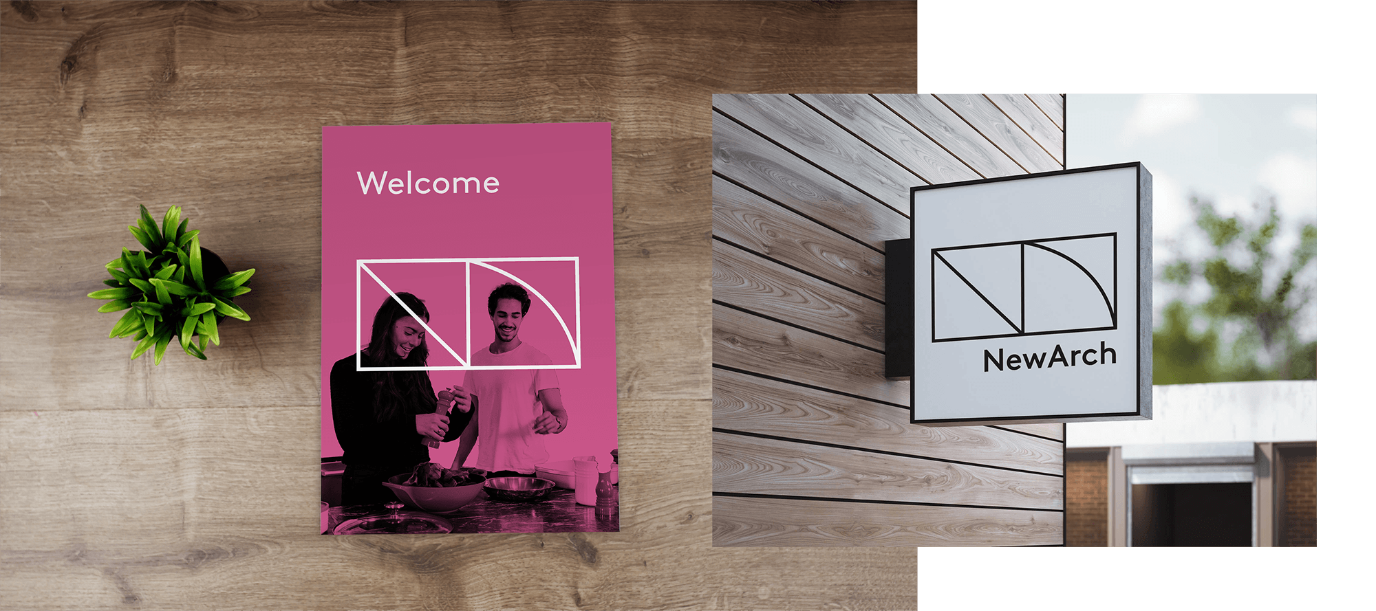
People were the second major ingredient. So much financial services design reaches for the same shorthand — glass skyscrapers, abstract CGI, disembodied handshakes — that simply centering the brand on real human faces was already a differentiator. It also connected directly to the brand’s tone of voice, which calls for communication that feels genuinely human. To make that people-focus ownable rather than generic, we introduced a halo device — a graphic outline drawn around individuals to signal positive impact. An investor benefiting from a tax-efficient product. A resident of a housing development we helped finance. A founder backed by Octopus Ventures. The halo gave us a consistent visual grammar for showing what Octopus does to people’s lives, while unifying a brand that had previously felt scattered across its different divisions.


The halo gave us a consistent visual grammar for showing what Octopus does to people’s lives, while unifying a brand that had previously felt scattered across its different divisions.
For complex financial products that couldn’t be captured in a single image, we developed a collage-based secondary visual language — built from brand colours, icons, and the pillar shapes. Collage is almost entirely absent from investment finance, which made it immediately distinctive and genuinely ownable.


We also addressed the palette. The brand’s tagline is ‘a brighter way’ — but the colours weren’t living up to it. We brightened and expanded them to match the optimism the business was projecting. And we changed the typeface to avoid sharing a font with a credit card company operating in an adjacent sector. Pink remained part of the palette — a legitimate part of the Investments identity, and a light connective thread to Octopus Energy — but it sat within a system rich enough to stand entirely on its own.


The core creative team was deliberately small: myself, one other designer, a small number of stakeholders, and the company founder. That decision was strategic. Keeping the group tight meant we could move quickly and protect the integrity of the creative work through its most critical early phase.
The rollout
The guidelines established during that initial phase became the foundation for a rollout that extended over two years — across the website, brand guidelines, social, print, regulated financial communications, and international markets including Octopus Australia. As the rollout expanded, I ran regular sessions with the wider design team to maintain alignment and keep the creative vision intact through a long and complex implementation.
The work was presented directly to the Executive Committee. The response from across the business said it simply: “Octopus looks more Octopus than ever before.” Which, given everything the brand needed to express — and everything it needed to distinguish itself from — was exactly the right outcome.
“Octopus looks more Octopus than ever before.”

The rebranded VCT products (top row) use collage to unite a family of complex financial products. Below, the same range before — a mix of styles with no common thread.

Social posts: before and after the rebrand


Co-designer: Jen Watts
Creative team: Johnny Campbell, Alex Hill, Mark Johnstone, Emanuel Zahariades