Future Generations Report

An annual report for Octopus Investments built around the theme of Hope — brought to life through a bright, visually dynamic design celebrating the achievements of different parts of the Octopus Group.

Future Generations Report

Every year, as a certified B Corp, Octopus Group publishes a report on how it’s living up to its values — not its financial performance, but its commitments to people, planet, and community. Think of it as a calling card for what the company believes in, aimed at employees and the public alike. The theme I was given for this edition was a single word: Hope.
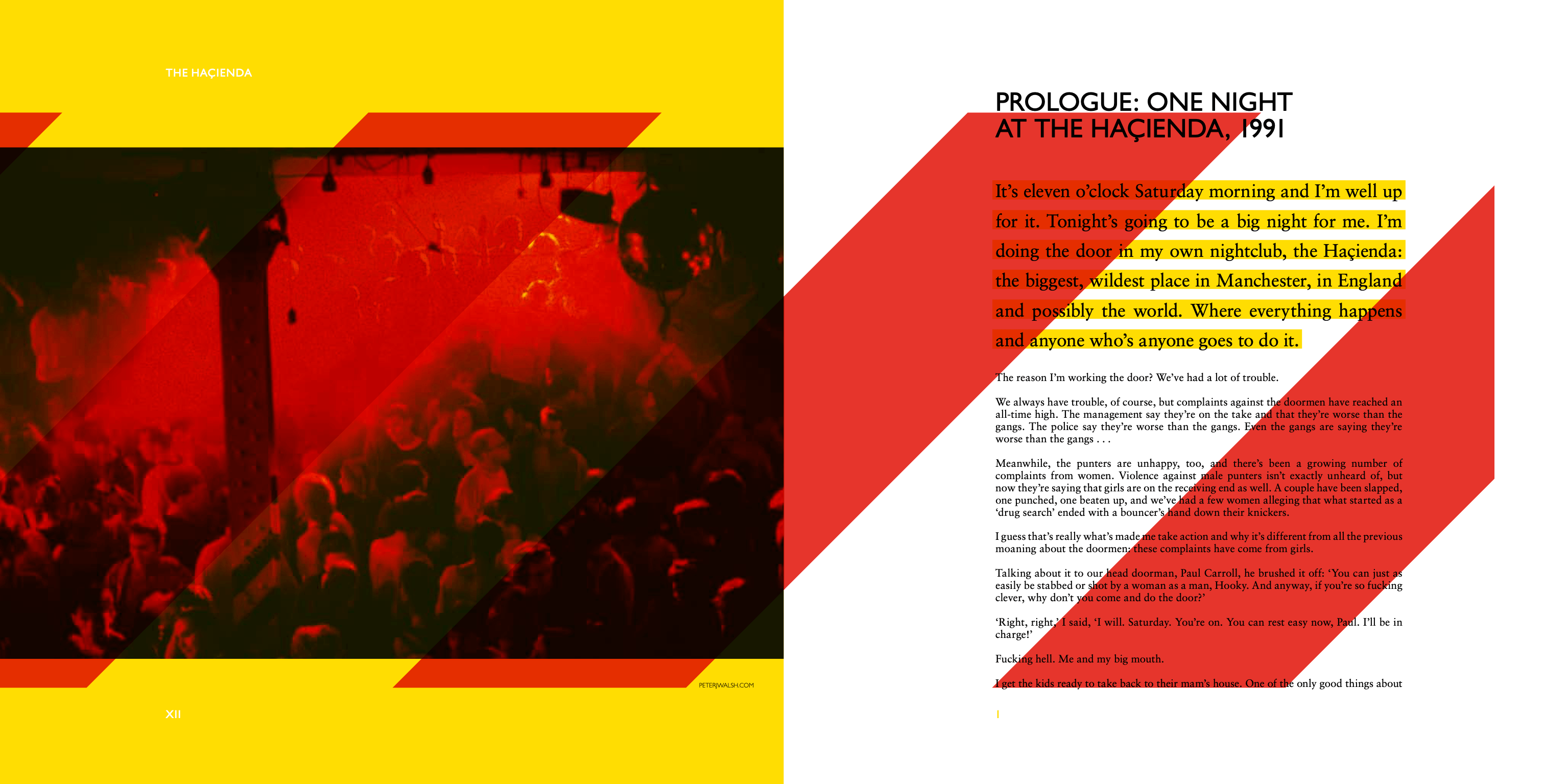
The thinking

Hope is an easy word to design badly. The risk was something bland and aspirational — stock photography of sunrises, soft gradients, meaningless warmth. I wanted to do the opposite: make something that felt genuinely energetic, even a little joyful, in a sector not known for visual generosity.

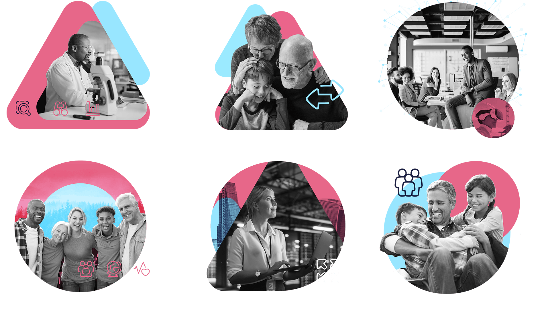
The visual language I developed centred on three motifs — starbursts, flowers, and fireworks — each carrying a quiet double meaning. A firework is light in the dark. A flower pushing through a pavement crack is resilience, not just prettiness. Together they built an abstract visual system that kept returning to the same idea without spelling it out.

I paired this with photography drawn from across the business: students at Aurora, Octopus’s special needs school brand; volunteers serving food at a soup kitchen; portraits of the people who run the financial products day to day. The principle was simple — always bring it back to people. And to contrast with the warmth of the photography, I introduced 3D imagery: bright, playful, slightly unexpected. The tension between the two visual registers is what gives the layouts their energy.

Future Generations report spread

A firework is light in the dark. A flower pushing through a pavement crack is resilience — they built an abstract visual system that kept returning to the idea of Hope without spelling it out.

The work

The result is one of the most visually ambitious pieces I’ve made in a financial services context — deliberately so. Annual reports in this sector tend toward the cautious. This one leans into colour, movement, and joy. The internal response was the strongest I’ve received on any project at Octopus, which inspired me to enter it for an industry award.

Creative team: Johnny Campbell, Alex Hill, Emanuel Zahariades

  • Octopus Investments masterbrand

    Octopus Investments masterbrand

    A company-wide rebrand for Octopus Investments, rolled out across every touchpoint — from visual identity and brand guidelines through to website launches and international markets.

    Read more

  • U.S. Election Design

    U.S. Election Design

    Volunteer work for Tech for Campaigns — a non-profit connecting design professionals with Democratic political campaigns. Two winning state-level campaigns, social content designed to work hard, travel fast, and speak directly to its audience.

    Read more

  • Center For Cartoon Studies: UI design + web development

    Center For Cartoon Studies: UI design + web development

    The Center for Cartoon Studies is an accredited cartooning school in Vermont — one of the few standalone college-level cartooning programs in the US. I’ve worked with them for over fifteen years, a relationship built on creative trust and a shared belief that the work should be as characterful as the school itself.

    Read more

  • Identity work

    Identity work

    A selection of logo projects spanning nearly two decades — from HIV charities and LGBTQ+ travel platforms to political festivals, water industry databases, and affordable housing initiatives. Each required a distinct visual language rooted in the client’s world, with ideas drawn from the work itself rather than generic design conventions.

    Read more

  • Future Generations Report

    Future Generations Report

    An annual report for Octopus Investments built around the theme of Hope — brought to life through a bright, visually dynamic design celebrating the achievements of different parts of the Octopus Group.

    Read more

  • NewArch affordable housing branding

    NewArch affordable housing branding

    A standalone identity built from scratch for Octopus Investments’ affordable housing initiative — warm, optimistic, and designed to feel like somewhere people actually want to live.

    Read more

  • Haçienda: How Not to Run a Club

    Haçienda: How Not to Run a Club

    A limited edition book designed for Foruli Editions, in three collectible formats, built around Peter Hook’s memoir of the legendary Manchester club, created in collaboration with designer Andy Vella.

    Read more